By Millicent Accardi
Of Portuguese descent, Almeida was born in Connecticut and moved to New York in 1984, where shortly after he began studying textile design at The Fashion Institute of Technology. Currently, he continues to work as a visual artist, primarily in mixed-media and ceramics (tiles and mosaics), free-lancing as a textile designer, an assistant art director for independent films, an art teacher and children’s book illustrator.
From NYC to New Delhi, India, Almeida’s group and solo exhibits include shows on Fire Island, NY, Bolivar Gallery in Santa Monica, CA, the National Academy of Contemporary Art in New Delhi, India, the Museum of Contemporary Art in Washington, DC, the Electric Lodge in Venice, and Studio 91 in New York City.
His colorful Azulejos-style tiles have been sold at the Lower East Side Tenement Museum gift shop (a designated Historic Site of multiple tenement houses, block long, once home to an estimated 15,000 immigrants, from over 20 nations, between 1863 and 2011). Almeida’s portfolio includes painting acrylic and watercolor ceramics, fused glass, stained glass, logo designs, sketches, printmaking and murals.
I was introduced to the artwork of Ralph Almeida when he created an azulejo tile to accompany one of my short poems for Global Poemic journal https://globalpoemic.wordpress.com/category/millicent-borges-accardi/
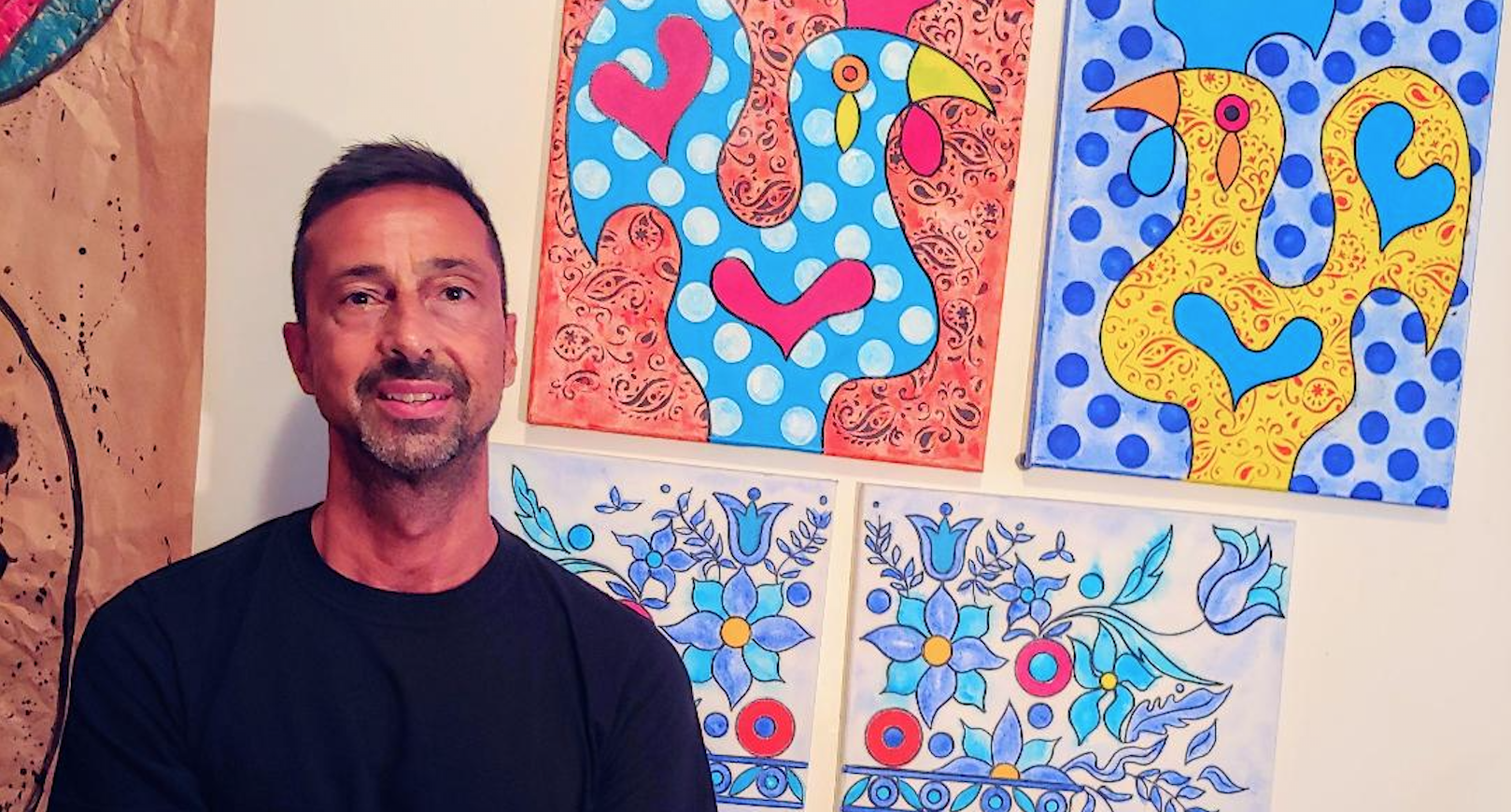
In this interview with Millicent Accardi, for the Portuguese American Journal, Ralph Almeida speaks on finding inspiration in his Portuguese heritage for his ceramic creations and of his fascination with the ancient art of Azulejos.
Q. You’re Portuguese-American. Can you tell me where your family is from in Portugal or the Azores?
A. My grandfather is from Funchal, Madeira. He met my grandmother in Brazil, and then they immigrated to the US thru Lowell, Massachusetts in 1920.
Q. Do you have family in Portugal?
A: I’m sure I do have family still there but, not that I’m in contact with. I visited Portugal back in the late 80’s. It was my first time out of the US. I then returned in 2017 with more of an interest in Portuguese tile making.
The city of Lisbon itself had a great effect on me. I love the Bairro Alto, Alfama, St. George Castle and the Azulejos museum. I felt myself in everything there. Its tiled facades and interiors, its gracious people, fado music, lively atmosphere and of course the delicious food.
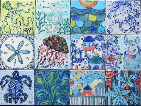
Tiles by Ralph Almeida
Q. A recent project of yours features Portuguese-style tiles. How did you get into making art tiles or Azulejo? What about the form attracted you?
A. My tile interest came to me while looking for something accessible to sell in addition to my artwork at outdoor festivals and retail venues. I did ceramics as a kid. So, I tapped back into that aspect of my creativity.
My textile background led me to discover a plethora of patterned imagery and inspiration, which I applied to ceramic tiles, based on my style of modern art and then quickly began to reference all forms of cultural design whether it was Portuguese, Italian, Spanish, Persian and/or anything of an ethnic background.
Azulejos are appealing to me for their ornamental and geometric designs, done simply in monochromatic blues and white they have a soothing quality to me. It felt intuitive to embrace that Mediterranean style of ceramics being Portuguese and Italian.
Q. Do you find inspiration in your Portuguese heritage?
A. In the past and currently you can find Portuguese imagery in my paintings and tiles. The Galo de Barcelos, the Coração de Viana (which is essentially a sacred heart), sardinhas and azulejos inspired imagery.
Q. Like the colorful cities of Porto and Lisbon, your artwork is composed of brilliant, true primary colors. Do you mix pigments?
A. Typically, I use colors straight from the tube, no mixing. Color in its purist and most vivid form interests me.
Q. I think PAJ readers might be interested in your tiles.
A. I sell individual hand-painted tiles, with various designs. I also do custom work for whatever your architectural needs may be. i.e., bathrooms and kitchens. Currently, a sampling of my tile work can be seen at http://raffa.art@homestead.com or through my direct email raffa.art@live.com) to discuss their options. I typically will send images of past projects and what’s available.
Q. Curious about your art process. Do you fire your own ceramics or take them somewhere to be fired? Can you reproduce a number of tiles (in the same pattern)? Or is each tile unique?
A. I have always relied on outside firing for the tiles. It can be costly and adds to the bottom line of cost. Cost effectively it works best when I can fill a whole kiln with tiles. 40 to 48 tiles at a time. I do hand painted tiles that are one of a kind and I can hand paint multiple tiles of the same pattern.
I also have a manufacturer who can do reproductions. It’s a digital transfer process. It does get fired but, at a lower temperature than regular ceramics. The tiles I make for the Tenement Museum are an example of this digital transfer process.
Q. Can you describe how you create a tile from beginning to end?
A. I start with a white porcelain bisque tile (a tile that’s already been fired). I paint directly on tile with ceramic paints known as underglazes. I may use a variety of techniques that include distressing, stencil work, paint washes, dripping, and scratching (sgraffito) into painted surface or I may just do a straight forward hand painted ornamental design. Sometimes the paint requires more than one coat depending on what kind of depth of color you are looking for. I then apply a clear glaze (which appears green upon applying) to the whole tile. Upon firing, this final glaze turns everything into a high gloss, shiny ceramic tile.
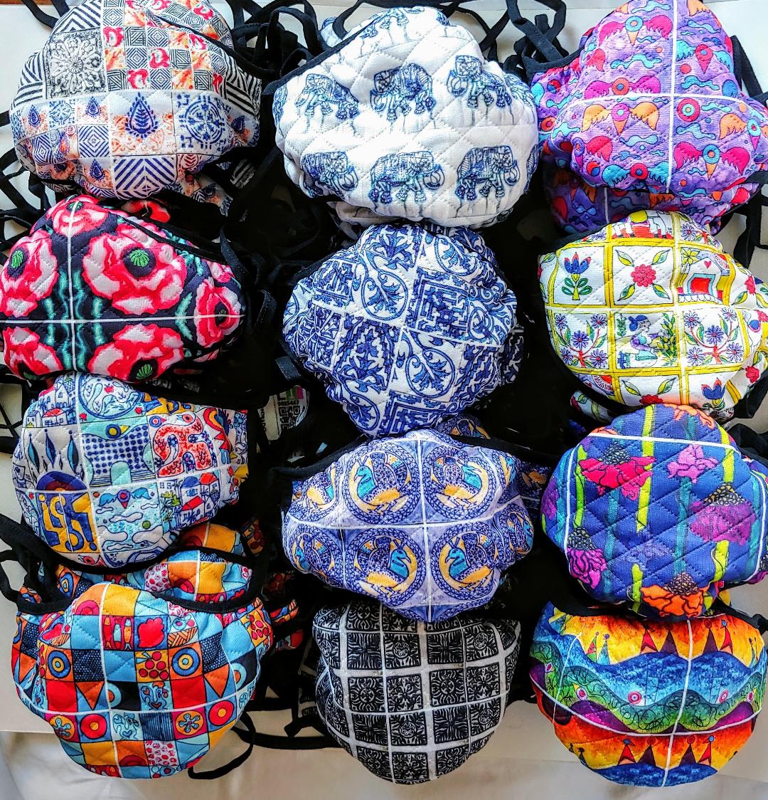
Protective masks on textile by Ralph Almeida
Q. You have a background in textile design and textile art—Which medium do you prefer?
A. I’m a painter and ceramic tile maker who incorporates his textile background into my mediums. They all never seem to leave my consciousness and come together in an intrinsic way. I love working in all my multidisciplinary forms.
Q. Is your studio in Brooklyn? What aspect of that borough attracts you?
A. My studio is my apartment. The street I live on in Brooklyn was a main draw for me. It has a bicycle path that leads to Brighton Beach and Coney Island. Prospect Park is close by and Brooklyn Museum hosts many a great show. Brooklyn is a peaceful respite from the bustling city.
I honestly find my real connection to culture in Manhattan. It always seems to have the sensory stimuli that I thrive on and informs my work in many ways. New York has been my home for 30 years. I also, lived in Santa Monica, CA. and would one day like to live back in South California. The lifestyle and over 300 sunny days a year (just like Portugal), are very appealing.
Q. What made you take the cross-country trek from New York to the West Coast?
A. California with all its sunshine, beaches and saturated colors was always a big draw for me. It was definitely a way to explore new avenues with hopes to establish myself in the west coast. I felt my colorful palette would fit really well in So. Cal. It turned out to be a successful move. I started teaching 4th and 5th graders art class. Took stained glass lessons in Venice, CA. Sold work at retail venues and did multiple outdoor art fairs.
Q. What artists influence you?
A. Artists that inspire include Miro, Calder, Kandinsky, Kerry James Marshall, Keith Haring, Picasso, Hilma af Klint, Georgia O’Keeffe, Faith Ringgold, Yayoi Kusama, Delauney, Klee, Clemente, Romare Bearden and so many more.
Q. Do you have a favorite Portuguese artist?
A. Querubim Lapa, the Portuguese painter, designer and very influential ceramicist is one of my faves. His work is full of modern forms, cultural context, vibrant colors, and textures that relate to the work I do.
Q. How did you first learn about Querubim Lapa ? What drew you to him?
A. Lapa has probably been part of my conscience since my first trip to Lisbon. It wasn’t till later in life when my interest in ceramics grew and social media offered me a place to immerse myself that I found myself revisiting his work. His mid-century modern style, textures, colors, symbolism and “of the natural world” themes appealed to my post-modern aesthetic. His municipal and educational installations are an inspiration to many an artist and ceramicist.
I feel like Querubim is to Lisbon what Gaudi is to Barcelona.
Q. I love the tile you created for the Tenement Museum gift shop in 2004.
A. Those tiles are available thru me, although I no longer work there due to recent circumstances. Past projects like the Tenement tiles can be viewed on my website also.
Q. I was first introduced to your work when one of my quarantine poems at Global Poemic was paired with one of your mosaic tiles. Can you tell me how you came up with this particular design?
A. I created that illustration in the style of an Azulejo tile. Considering that you and I are both Portuguese, and I already work in that tile format, I thought it was a great idea to represent your poem
“For Truth Would Be From A Line” in an Azulejo style tile. I usually do a free association thing when reading poems and write words, sketch symbols and other imagery that are reflected in the writings. I can reproduce it in tile form if anyone is interested.
Q. Your paintings and tiles seem both symbolic and whimsical. How would you describe your work?
A. As a combination of ancient and modern with visceral and tactile qualities that have a universal appeal.
Q. Do you have an upcoming art show?
A. I’m looking to stage some open studio visitations in Brooklyn by appointment only (during the pandemic). I currently have no exhibits going on, partly due to Covid-19. One can always schedule an appointment to come for a viewing.
Q. Can you tell PAJ readers what project you are working on now?
A. I’m currently working on custom fleur-de-lis tiles for a virtual silent auction. Oceanic-themed tiles for a retail venue. An upcycled series of cardboard forms reminiscent of masks. A wood-burning series that incorporates tile designs, and a series of flower totemics that are on paper.
Also, I continue to illustrate for Globalpoemic.com and you can see more of my work there along with other fab artists and poets.
Millicent Borges Accardi is the author of three poetry books: Injuring Eternity, Woman on a Shaky Bridge, and Only More So. She has received fellowships from the National Endowment for the Arts, Fulbright, CantoMundo, California Arts Council, Barbara Deming, Fundação Luso-Americana (FLAD), and SOPAS, Special Congressional Recognition for poetry in the California Portuguese community. Her new work appears in The Journal, Quiddity, Another Chicago Magazine and Laurel Review. Find her on Instagram and Twitter @TopangaHippie

