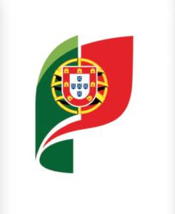
The Portuguese government has created a new “brand” to identify its administration services, with a more digital-friendly logo, resulting in a “formal synthesis” of the national symbols, aiming to create a more “inclusive, plural and secular” image.
While the previous logo was closely associated with the national flag, the new image is a more simplified version consisting of three plain geometric shapes, a green vertical rectangle, an oversized yellow circle and a red square.
 The new logo, which was implemented at the end of July and has been on the Government’s digital platforms for months, was not detectable until recently when it became widely contested by the public. A petition is circulating in social media demanding to bring it down and to stop its use.
Those in opposition claim that the initiative was promoted by the politically correct left-wing “wokism” – resulting in an image that looks more like the flag of Mali; that it is disrespectful to the national values; and that it was implemented without democratic input and approval.
However, according to the Prime Minister’s office, the simplified version (without the allusion to the castles conquered from the Moors; the armillary sphere alluding to the imperial dominion; and without religious invocations), became “more inclusive” and even more “ecological”.
 The government source also notes that the previous twelve-year-old symbol was never the target of any controversy, concluding that the new image “is more operative and functional” and that fully preserves the national flag as the symbol of Portugal.
The source has also reiterated that the virtual flag image does not replace the official National Flag, established on October 5, 1910, following the Republican Revolution and is to this day “duly enshrined in the Constitution of the Portuguese Republic as a symbol of sovereignty, independence, unity and integrity. It does not, therefore, interfere with its status, dignity, or representativeness.”
The project was developed by Studio Eduardo Aires, led by designer Eduardo Aires, a Professor in the Department of Design at the Faculty of Fine Arts of the University of Porto (FBAUP). The government allegedly paid 74 thousand euros to create the new institutional symbol.
Portugal’s National Flag has undertaken many changes over time. The current flag is based on a red-green chromaticism, including nationalistic and religious symbolic details as decreed by the Republican Government formed following the 5th of October 1910 and approved by the National Constituent Assembly (Decree 19th June 1910). The green in the flag represents the hope of the nation and the red symbolizes the blood of the people who defended it. The coat of arms at the center is inspired by meaninful national symbols. The first known flag, a square white flag with a dark blue cross, was created in 1095, under the rule of Count Henry of Bologna, the father of Afonso I the first king of Portugal.
PAJ/Staff

